Building a single page theme with WordPress and Bootstrap
Exercise 4 Part 1
Salvattore
Salvattore is a simple, low weight masonry layout library that does what it says on the tin. Easy to configure and integrate.
Go to salvattore.com for documentation and the code from github.
For this exercise, download this code example: salvattore.zip
Note : Salvattore must be loaded from a web host to work!!
Add the salvattore folder to htdocs
Download the salvattore folder and drag the folder to your localhost htdocs folder located inside your MAMP application folder. (See this post to configure MAMP and find your htdocs folder.)
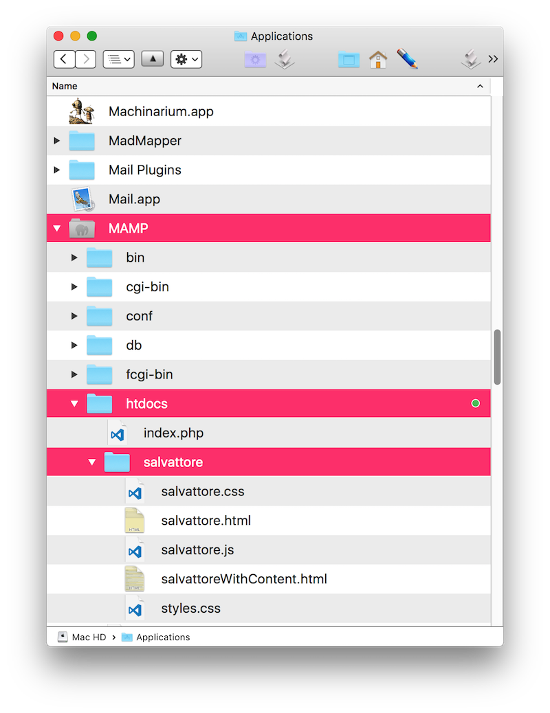
Salvattore example folder placed inside htdocs.
Run the example in the browser via localhost
With MAMP running, load the example file inside the salvattore folder by typing the URL path to the example file :
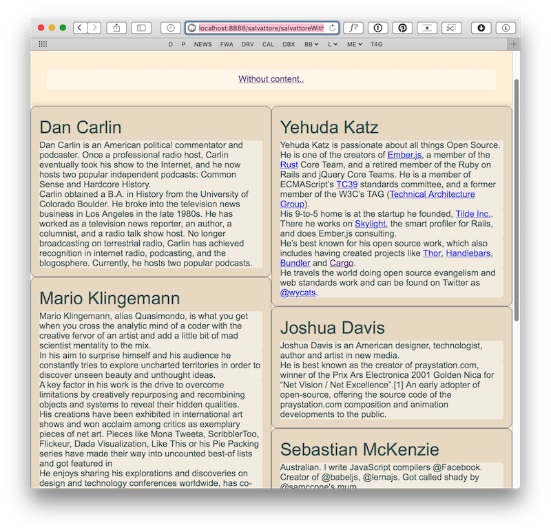
http://localhost:8888/salvattore/salvattore.html. The example page will display a number of elements arranged in columns. Resize the browser window to see the elements reflow into more or fewer columns. Click the link at the top of the page to see the example with more content to see the masonry effect in action.
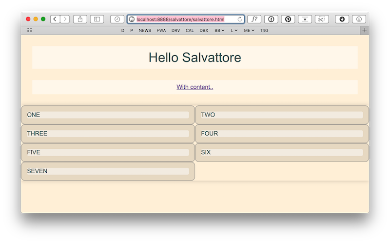
Example loaded in the browser
Inspect the salvattore.html code
Open salvattore.html. The masonry layout is created by linking the salvattore.css stylesheet file and the salvattore.js javascript file to the page. With these files linked, a masonry layout is created with a <DIV id=”grid” data-column> element that acts as a container the masonry elements. Any DIV nested inside the container DIV will display in a masonry style e.g.
 <div id="grid" data-columns >

    <div> ONE </div>
    <div> TWO </div>
    <div> THREE </div>

 </div>
the above snippet will cause divs ONE TWO and THREE to display side by side in columns. The columns will reflow into more or less columns as the browser window is resized.
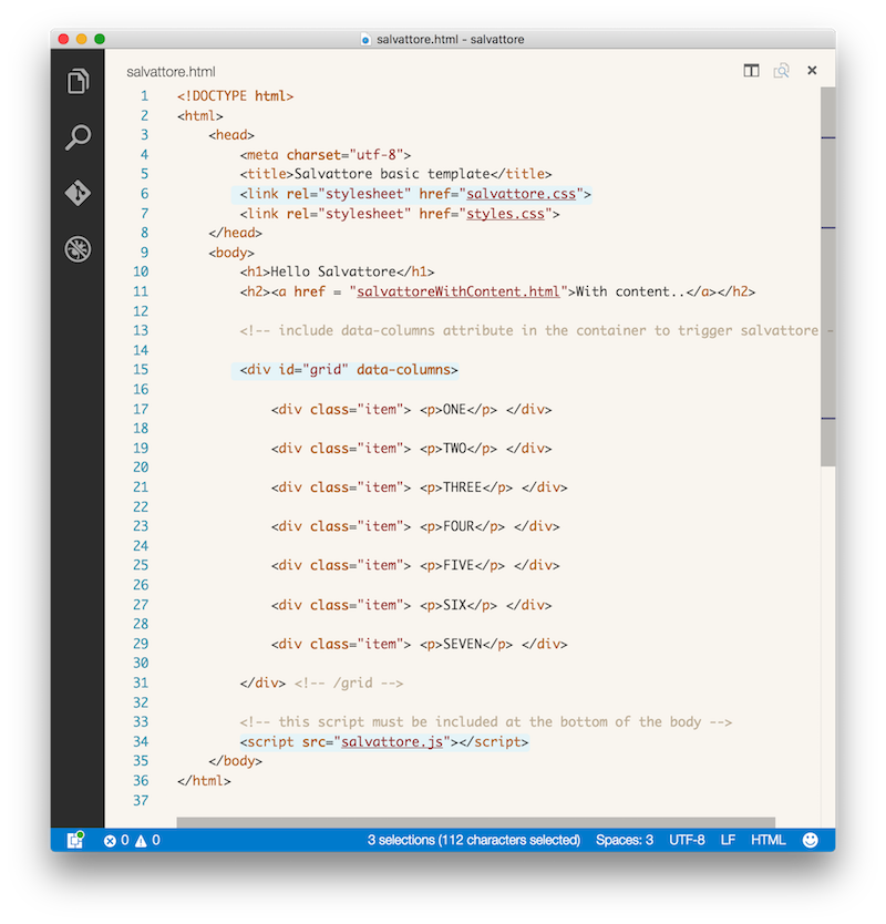 salvattore.html code. The highlighted elements are necessary for masonry functionality.
Note the nested masonry divs all have an “item” class applied. This class is NOT required for the masonry functionality, the class has been added to apply the colour and type styles seen on the elements.
Inspect the salvattore.css stylesheet code
Salvattore behaviour is controlled with the css style rules in salvattore.css. You can set the reflow breakpoints with media queries to specify how many columns will be displayed and at what size. The salvattore.css file has been configured with a number of media query breakpoints – note these are the same breakpoints used by the bootstrap framework.
You can specify the number of columns to be displayed at a given breakpoint by using the #grid[data-columns]::before selector and adding :
content: ‘1 .column.size-1of1’; for a ONE column grid,
content: ‘2 .column.size-1of2’; for a TWO column grid,
content: ‘3 .column.size-1of3’; for a THREE column grid and so on.
The complete rule for a three column grid looks like this :
#grid[data-columns]::before {
content: ‘3 .column.size-1of3’;
}
We want this rule to be applied when the browser is set to a desktop size between 992 and 1199px, So the above rule is wrapped in a media query that will trigger when the window is at that size :
@media screen and (min-width: 992px) and (max-width: 1199px) {
#grid[data-columns]::before {
content: ‘3 .column.size-1of3’;
}
}
The salvattore.css file contains media queries for a variety of screen sizes, each with a rule specifying the number of columns to be displayed at that size.
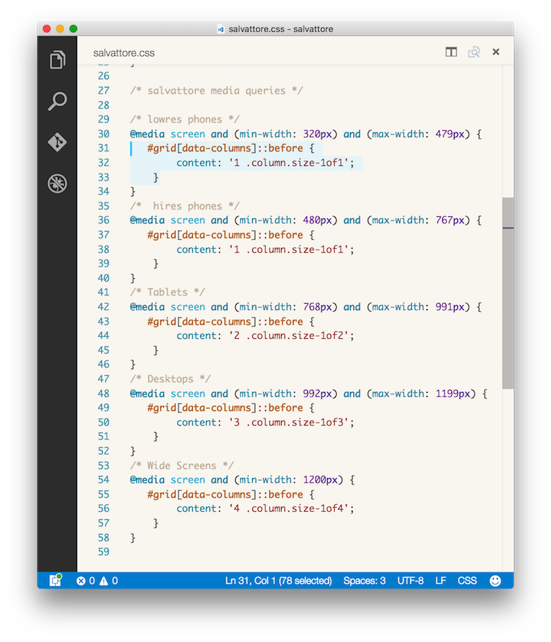
salvattore.css media queries.
Modify the number of columns displayed at different screen sizes.
Edit the salvattore.css file so that more or less columns display at a certain screen size. Pick one of the screen sizes and change the appropriate rule. For example, if you wanted to change the above rule to display 4 columns at ‘desktop’ screen widths instead of three you would change the rule from
content: ‘3 .column.size-1of3’;
to
content: ‘4 .column.size-1of4’;
The complete rule would look like this :
@media screen and (min-width: 992px) and (max-width: 1199px) {
#grid[data-columns]::before {
content: ‘4 .column.size-1of4’;
}
}
Add some more content to salvattore.html
Add some more content (whatever you want) to the masonry elements in salvattore.html. Add more elements and re-style them so you are confident you understand the system. Use salavattorewithcontent.html as a guide.
salvattorewithcontnet.css showing the layout with content in each item.
Comments by Dave
Interactive Video and Audio
thank you Octavian appreciate it!